
2022 Market Analysis

It’s time to do a full, in-depth analysis of the markets. We’re diving deep today to hypothesize projections for the rest of the year.
Let’s dive into macroeconomics first.
The theme for almost two years was “inflation is transitory, let the printer go brrr.” More money into the markets, more assistance from the Fed, more hopium instilled in investors all led to the eventual backfire the market has seen recently.
However, the writing was on the wall. We saw this coming - let’s discuss cause and effect.
2020-2021
COVID → quarantine/lockdowns → increase in unemployed
Stim bills → “printer go brrr” → unemployment pay > salary → further increase in unemployed
“Printer go brrr” → additional money supply → $DXY devaluation → inflation? (wait no.. it’s transitory though..)
$DXY devaluation → more money into equities as a hedge
More money into equities → V shaped recovery → tech boom due to COVID
Tech boom → blowout ERs → raised guidance → parabolic pumps → unrealistic P/E
Unrealistic P/E → overvaluation → who cares, market only goes up amirite?
All the above →$NQ +153% from the low → $ES +121% from the low
2021-2022
November: “We’re going to stop pouring money into the markets.”
December: “Hey fam, my bad - inflation isn’t transitory. Hope you enjoyed the pumps!”
Also December: “We got a special promo for next year: buy 3 rate hikes, get 1 free!”
And alas… the fear arrives. But like I said, we saw this coming eventually. All of the prior macroeconomic events led up to this very day.
Why are growth stocks (tech) a leading indicator?
If yields are high, rates are high, earnings are expected to decrease as business expenditures increase → lower guidance → lower expected growth → reversion to mean reflected in stock price
Money rotates into value/lower P/E stocks
We’re now putting pieces of the puzzle together.
Oil
Oil can be an indicator of economic stability.
higher oil prices → higher production costs → lower productivity → lower growth → negative effect on companies’ earnings/revenue
“Hey California, tank’s empty? $7/gallon to fill, thanks!”
Wait… can oil be a leading indicator as well?
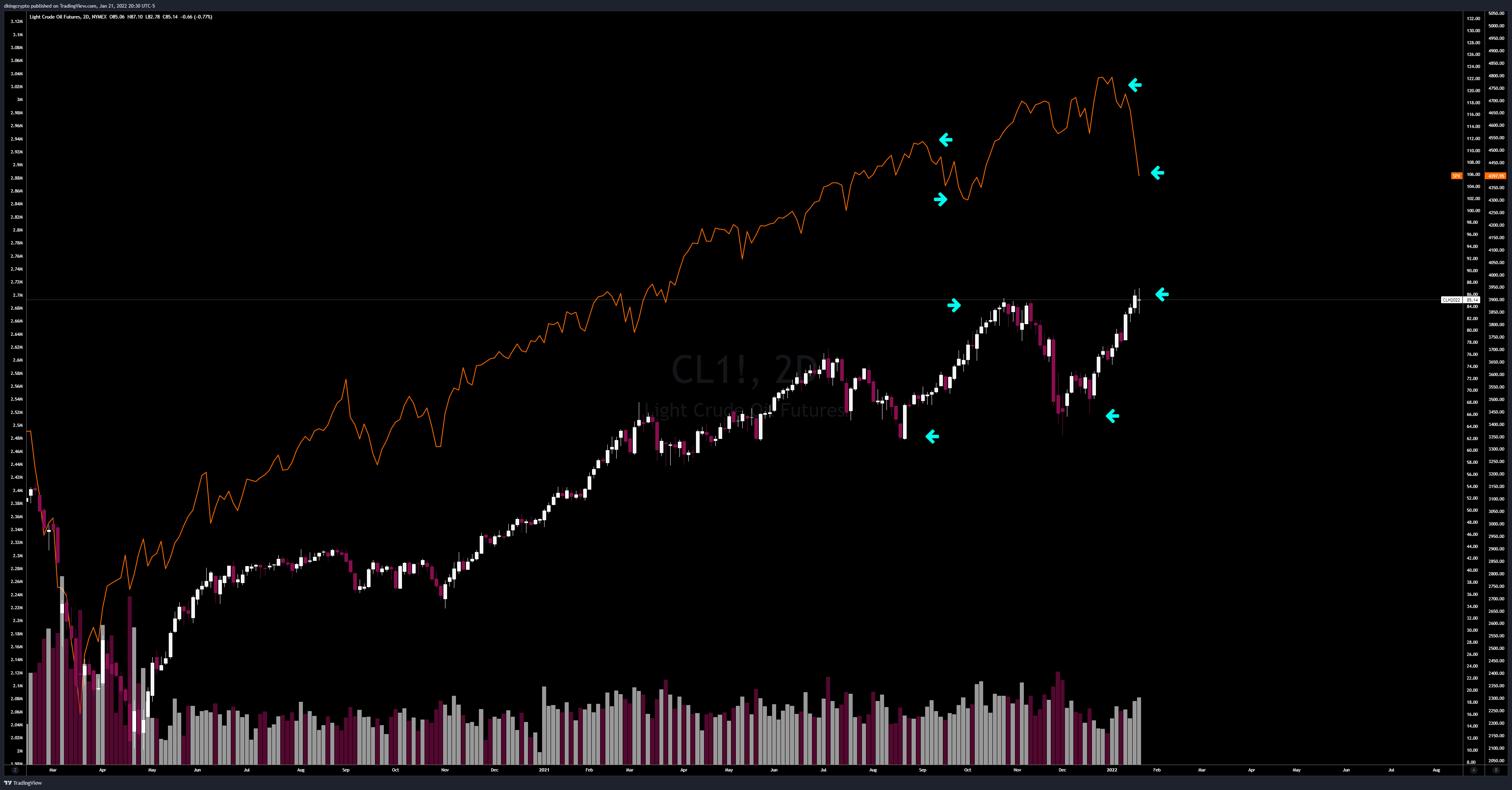
Let’s take a look at the inverse correlation of $SPX (orange) and $CL1! during the Gulf War:
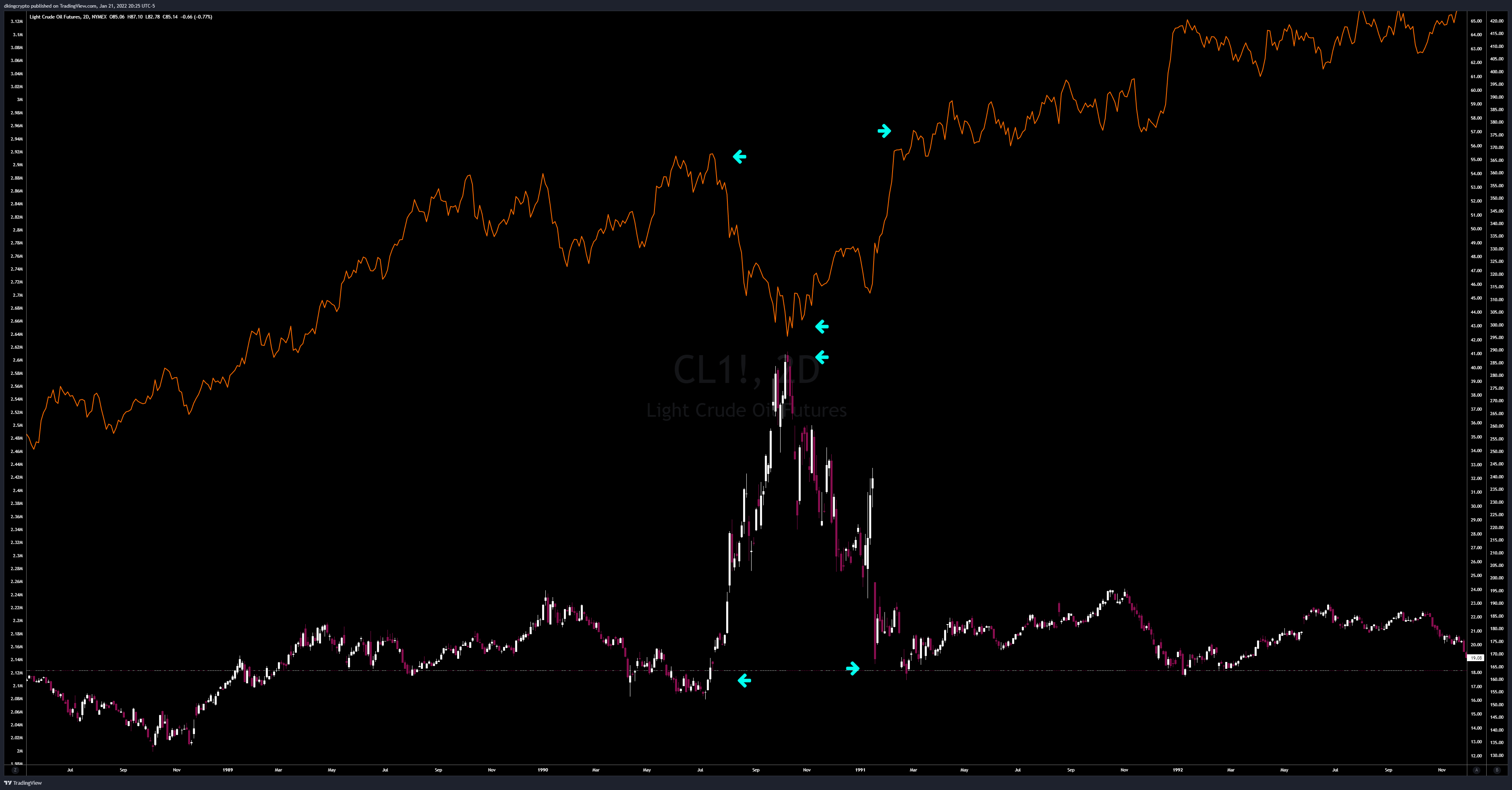
Present day:
Whoa, this is cool! But Eli5.. how does oil tie into this?
see above
higher oil prices → higher costs → higher inflation → higher yields
lower oil prices → → oil-producing countries suffer → oil-producing countries look for safe havens → US bonds → higher bond prices → lower yields
But why does this matter? Why is oil mooning?
Simple: demand > supply
Different countries recovered from COVID at various rates, hence increasing the demand while supply growth lagged
Let’s also not forget what’s happening in Ukraine and the US’s potential involvement
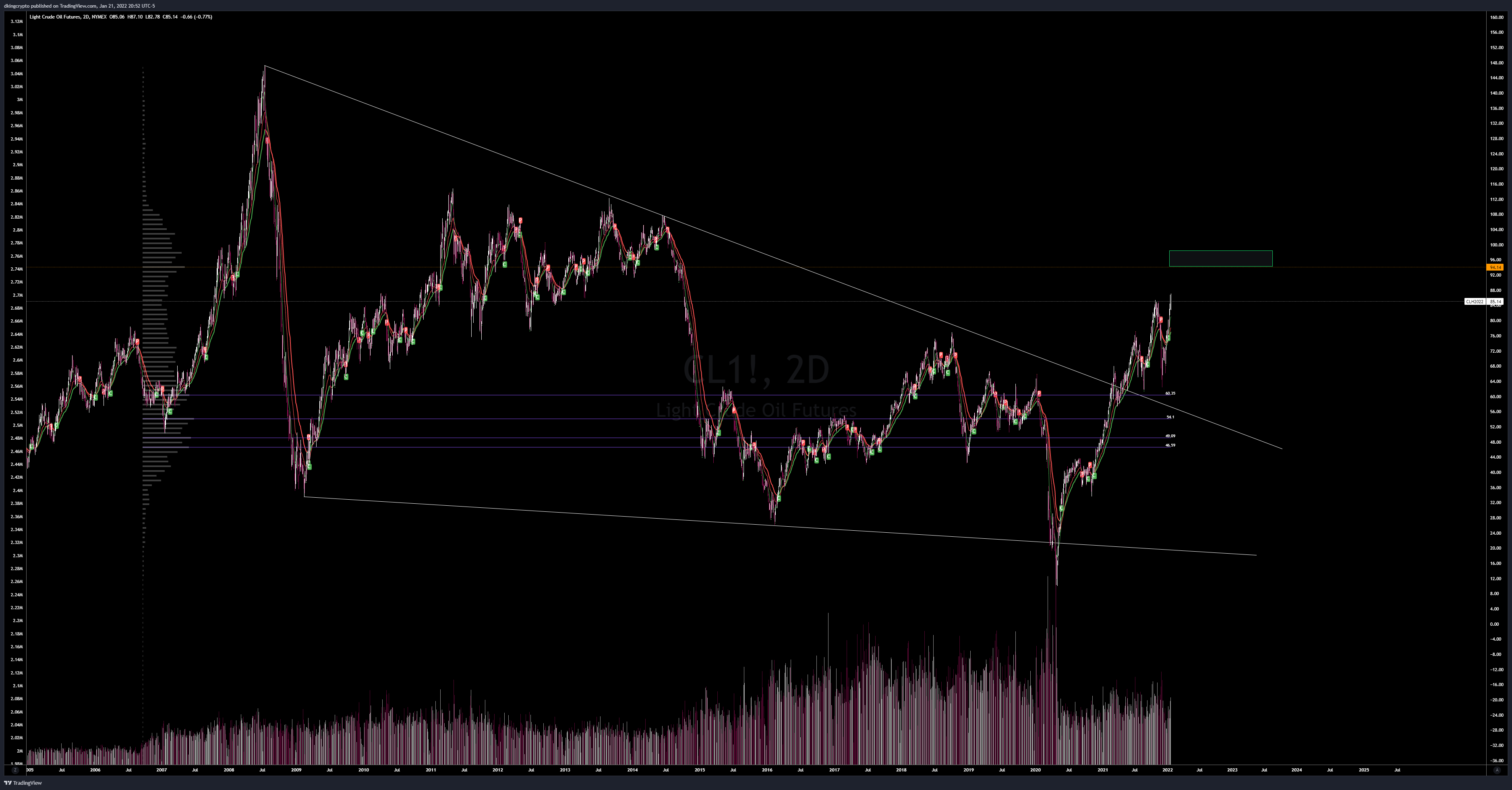
So far, oil is looking quite bullish and can be the leading indicator to further pullback in equities, alongside other macroeconomic indicators. We broke out of a 14 year wedge and continues to print HHs, HLs.
Possible target 94+ by mid-Q2
Okay, get to the point DKing - wen moon? wen long? wen bounce?
DKing’s 2020 Analysis (Fractal v1.0)
Last year, I spent hours analyzing potential market movements based on the 1960-1970s. We experienced very similar global events (more detailed analysis can be found in the Discord). This thorough analysis allowed me to provide an accurate ATH for SPY on both time and price.
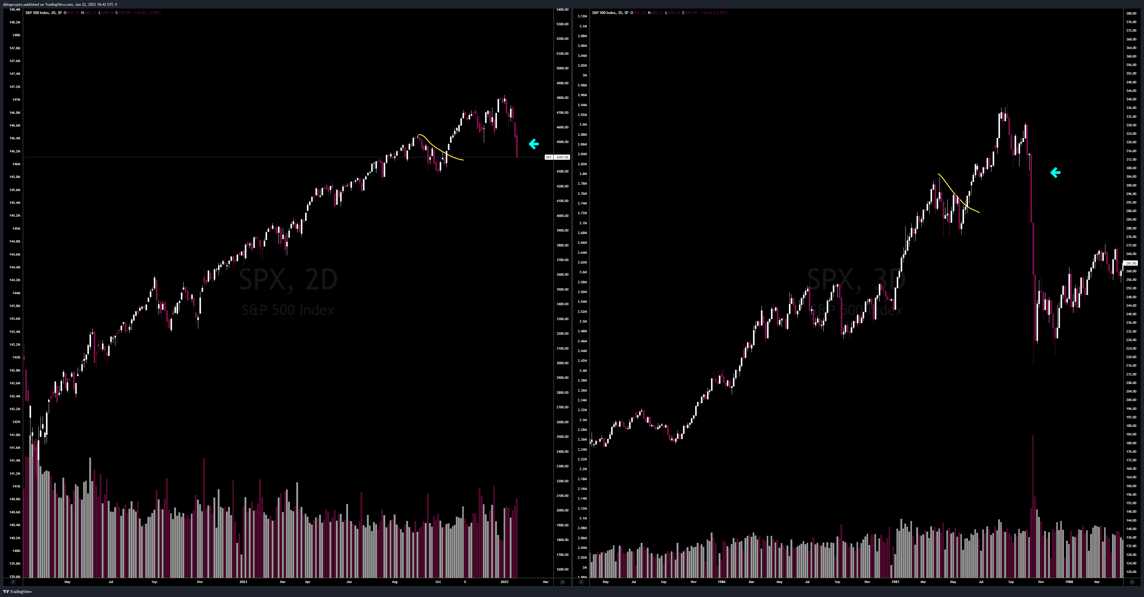
Here’s just a quick chart as a reminder:
Left: 2018-2020 | Right: 1960-1970s

The question is.. are we still following this fractal?
“History doesn’t repeat itself but it often rhymes.”
Fractals can deviate, as has my previous one. We have to look at all factors surrounding the current market and comparing it to similar history.
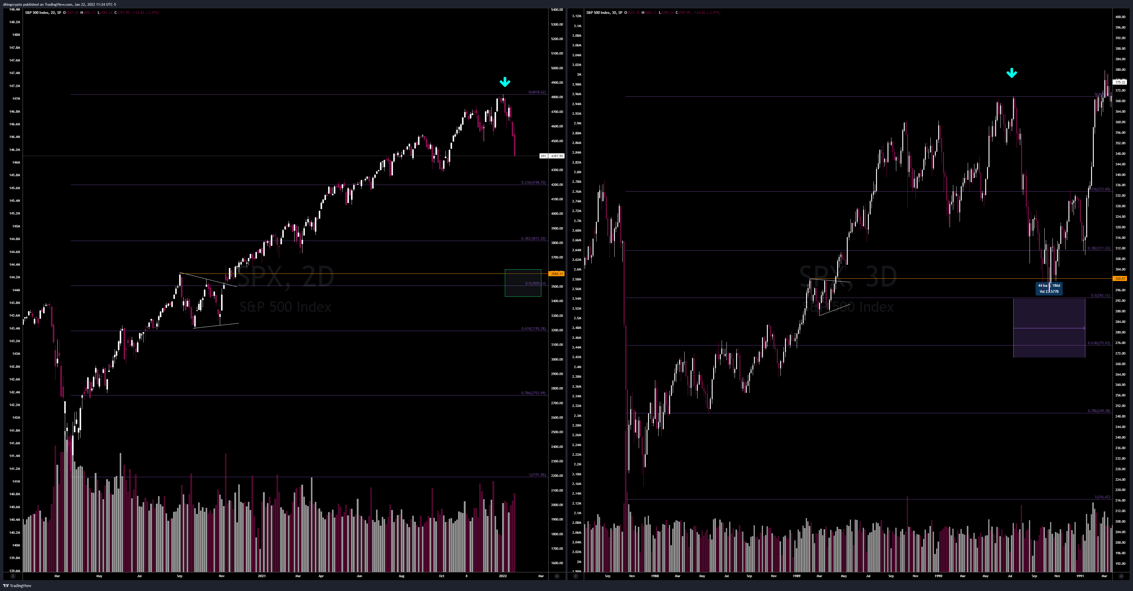
Let’s take a look at pre-COVID vs present day:
We saw a 120% gain on $SPX from the low and 42% gain from previous ATH prior to the COVID dump - all in less than two years.
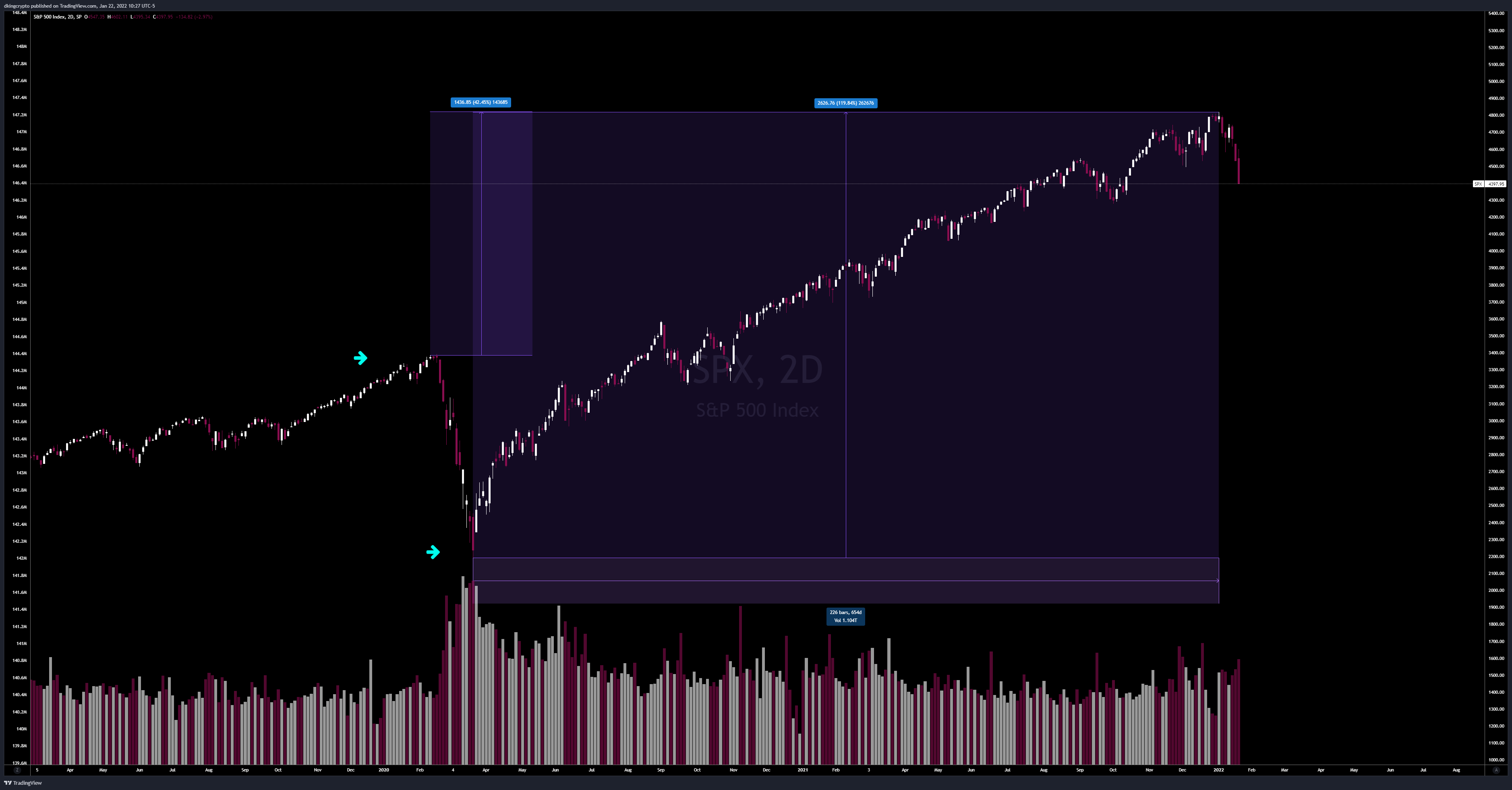
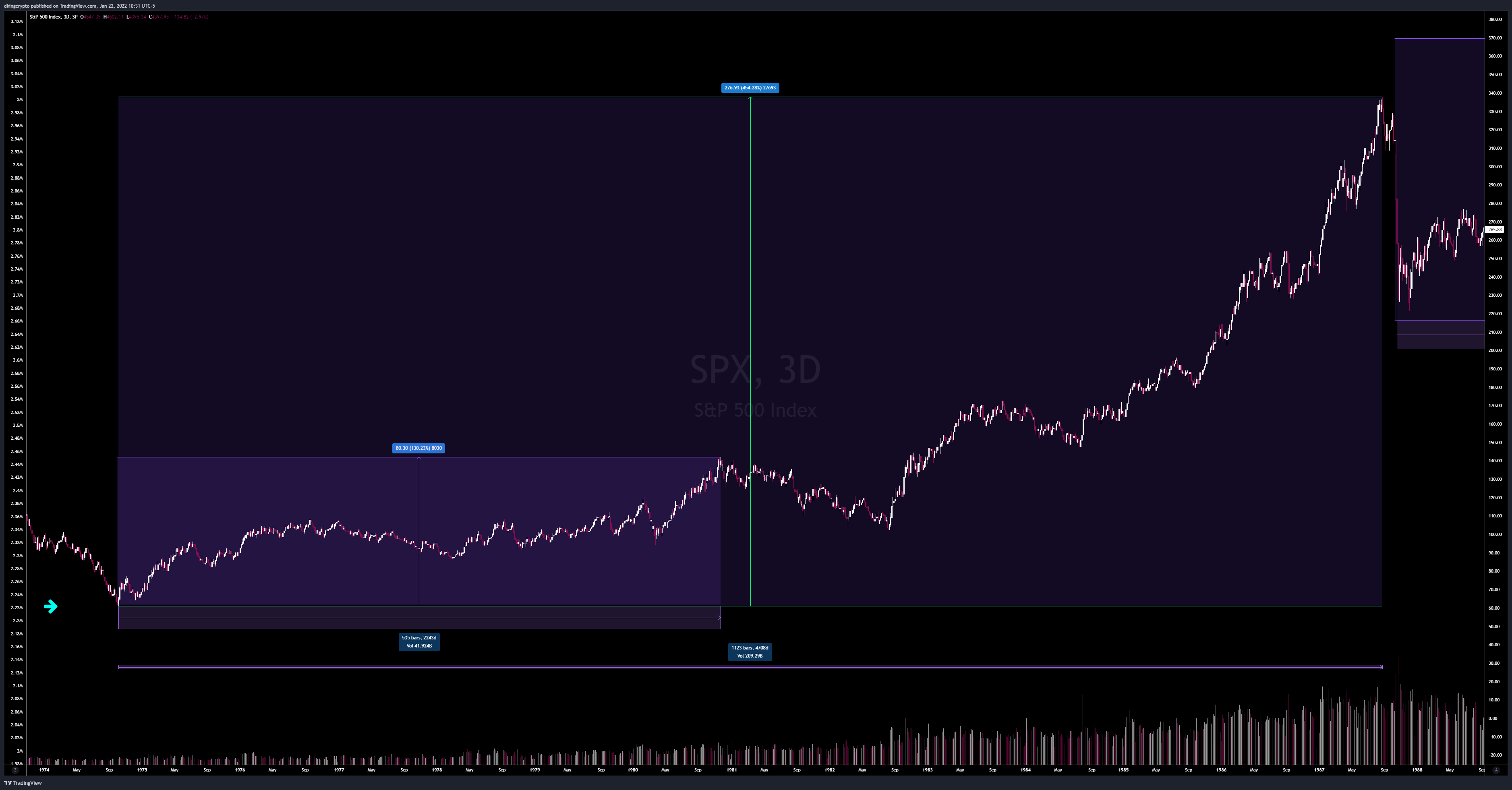
Going back to the old fractal analysis, $SPX saw a 454% growth from the low created shortly after Nixon was elected in ‘74. This took 13 years, which eventually led to Black Monday:
Being devil’s advocate: we do see some similarities in the economy leading up to Black Monday and current day. Both Trump and Reagan had slightly similar economic policies during their reign. Two major similarities that set a precedence: tax cuts + astronomical national debt.
So, is Black Monday coming?
Doubtful. Black Monday occurred during a very different time in the markets. This era had structural flaws. Circuit breakers also weren’t implemented until post-Black Monday. But a Black Monday-type event could be a possibility - just not at the same severity.
Could we actually be near the end of the previous analysis?
Towards 1980-1981, yields and inflation were skyrocketing. Yields hit a high of 15.84% in 1981 while inflation reached over 14% in 1980. Eerily similar economic situation we’ve seen the past year, albeit much lower percentages at this time.
If the old fractal is in play, we could be at the same point of 1980 year-end. If this is the case, a recession is possible (similarly to ‘80-’83).

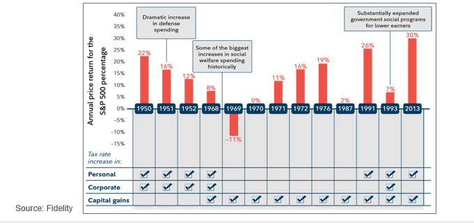
Quick note on corporate tax:
Studies have actually shown a hike in corporate tax has been beneficial to the markets. In 13 instances of tax hikes since 1950, $SPX had higher average returns despite the increase.
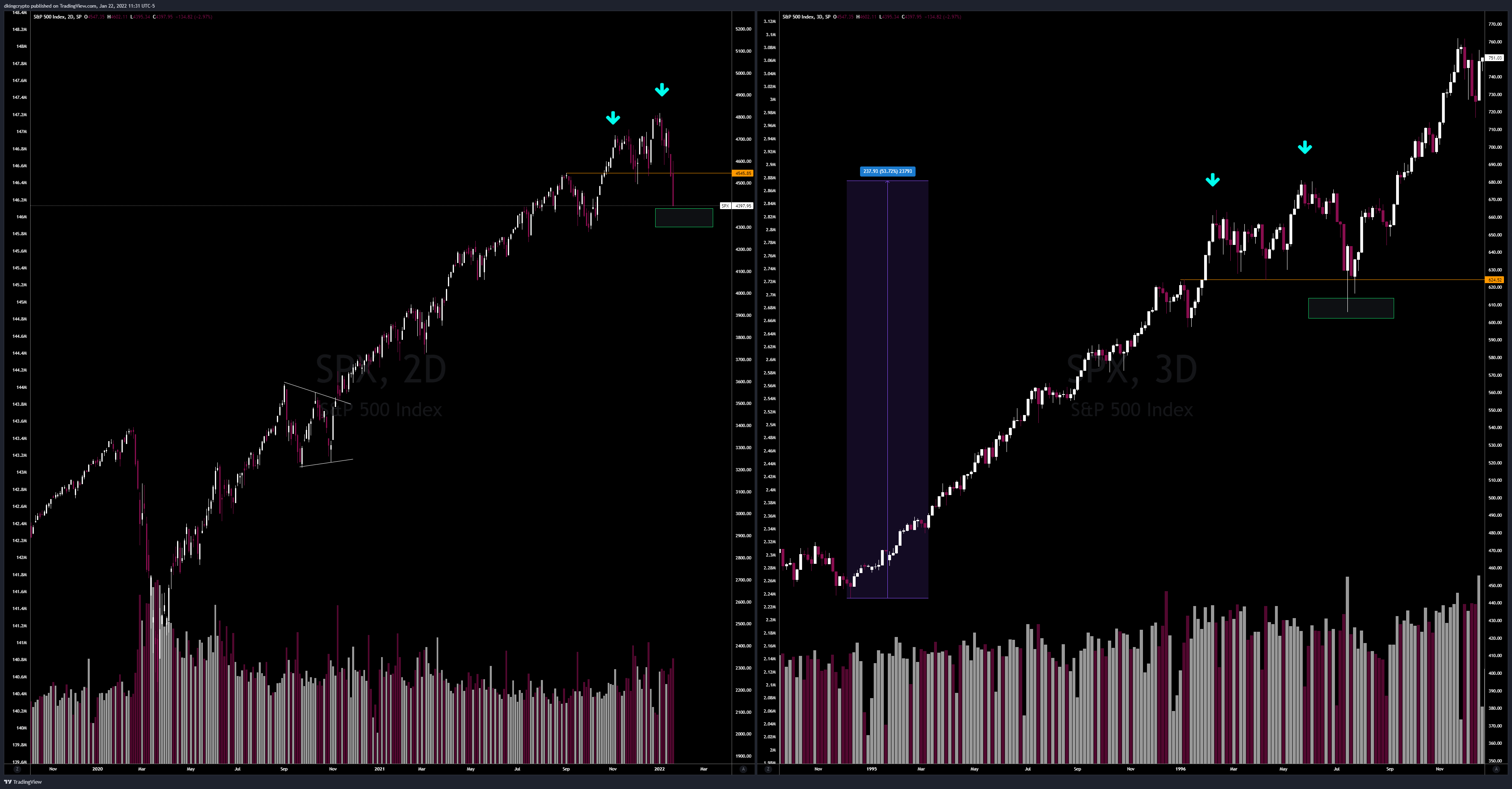
Fractal of the late 1980s-1990s (Fractal v2.0)
The 1990s decade started with a short recession as a result of the Gulf War (see oil analysis), slow economic growth, decreased job creation, and rate hikes.
Sound familiar?
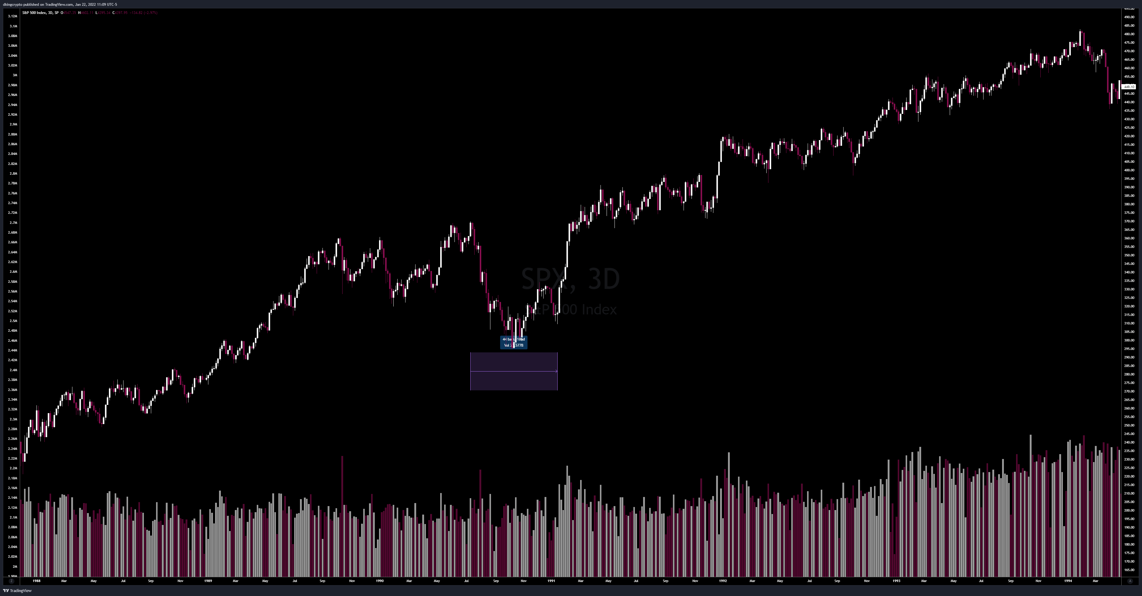
If this theory is correct, we could be at the beginning of the millennial decade. $SPX saw about a 20% decline from the peak in 1990 after a 71% gain from the Black Monday low - right into the pennant structure of March ‘89.
A 20% decline on $SPX today would bring us to about 3840. A similar retest of the pennant structure in Oct ‘20 would lead to a ~27% decline from our recent highs, putting us around 3500-3600 on $SPX.

This fractal is extremely likely, in my opinion - especially when you consider a 120% move (present day) vs 70% move (1980s).
If we use fibs here, the 1990s recession provided an accurate retest of the .5 level from Black Monday low to its peak.
Using fibs from the COVID low, the .5 level lines up perfectly with the aforementioned targets (3500-3600).
Fractal of the 1994+ millennial boom (Fractal v3.0)
Shortly after the recession of the early 1990s, the US economy boomed. GDP growth surged, employment surged. It was a good time to be alive.
Although the charts look eerily similar, there are faults in my fractal analysis of the millennial period.
The main fault is that our current economic conditions are the complete inverse of the millennial period. In fact, it may be get worse before it gets better.
What’s the point in sharing this then?
I personally don’t foresee another COVID-like dump in the markets - not with that severity and velocity.
Analyzing these different eras allows me to gather multiple confluent data points to hypothesize potential scenarios for the future of the market.
I’m not going to sit here and give you projections with 100% conviction, because I can’t. Last year, I had 100% conviction in my fractal analysis. This year, not so much.
Am I bearish? Yes. Am I bullish long term? Yes.
The most important takeaway from this entire paper is that we need to trade the market level by level. I even had a thought that this year’s market had similarities to 2018 (btw, they had four rate hikes in 2018 as well).
Let’s get to the point and discuss my final projections:
We must trade the market day by day, level by level.
$SPX
If the economy bodes well: no severe rate hikes, increased employment, increased GDP, accelerated COVID recovery - we can likely follow the millennial fractal and see new ATHs after this dump.
All of my targets on $SPY have hit this week (all given in Discord): 440.40, 438.58. My last target is 436.05, which is the gap fill from Oct ‘21.
This 4360 target puts us right at the bounce level in the millennial fractal. (green box)
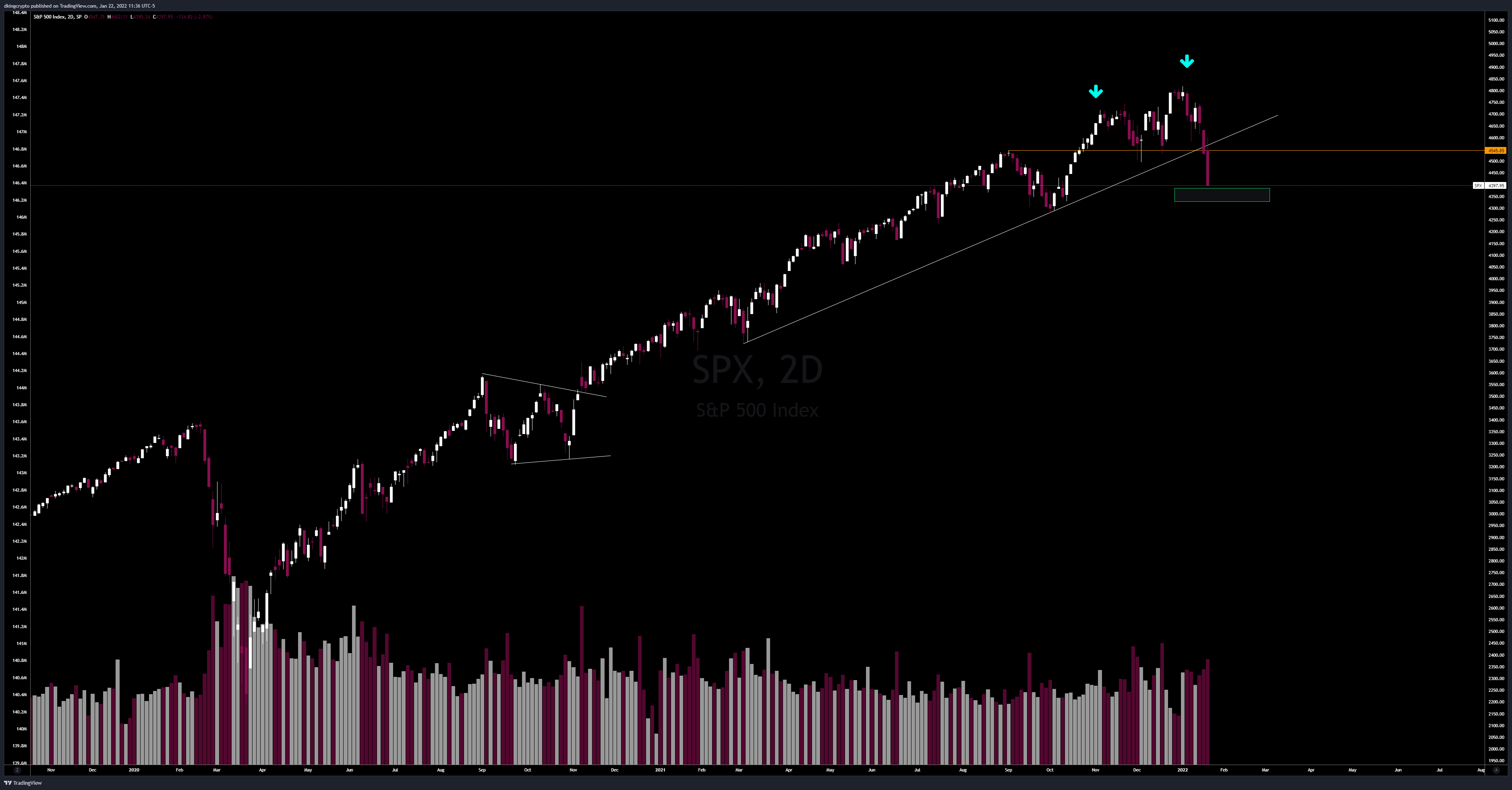
We would need to see a reclaim of 4400 to be remotely bullish.
If we’re unable to hold 4360, the next level of interest is 4200.

Failure to hold 4200 will cause the late 1980s fractal to become the likely scenario for the markets. This may take a year or two to play out, depending on our economic recovery.
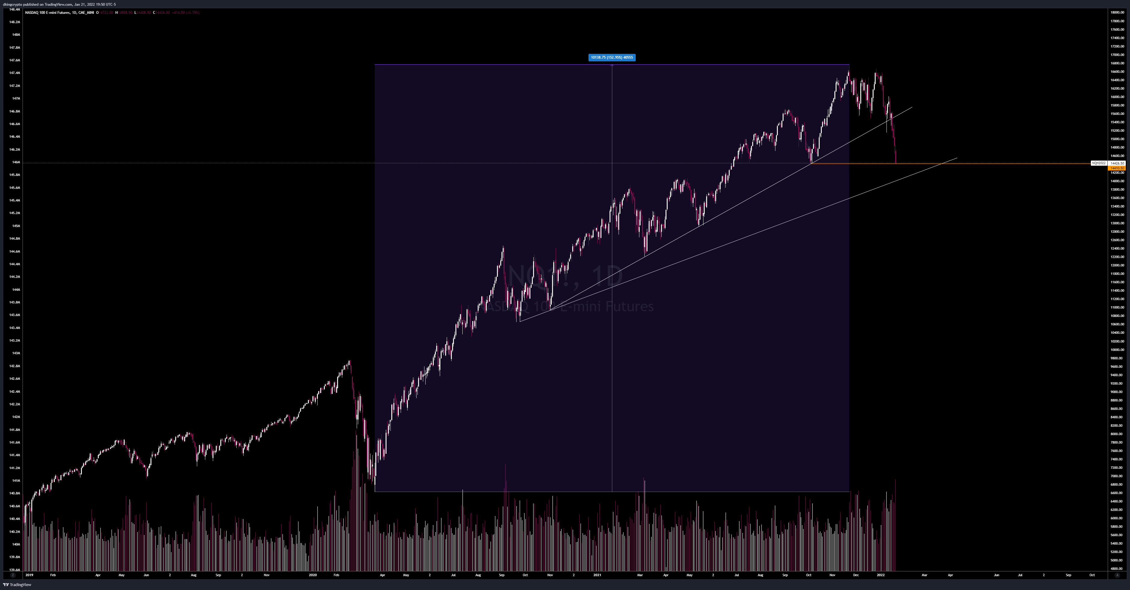
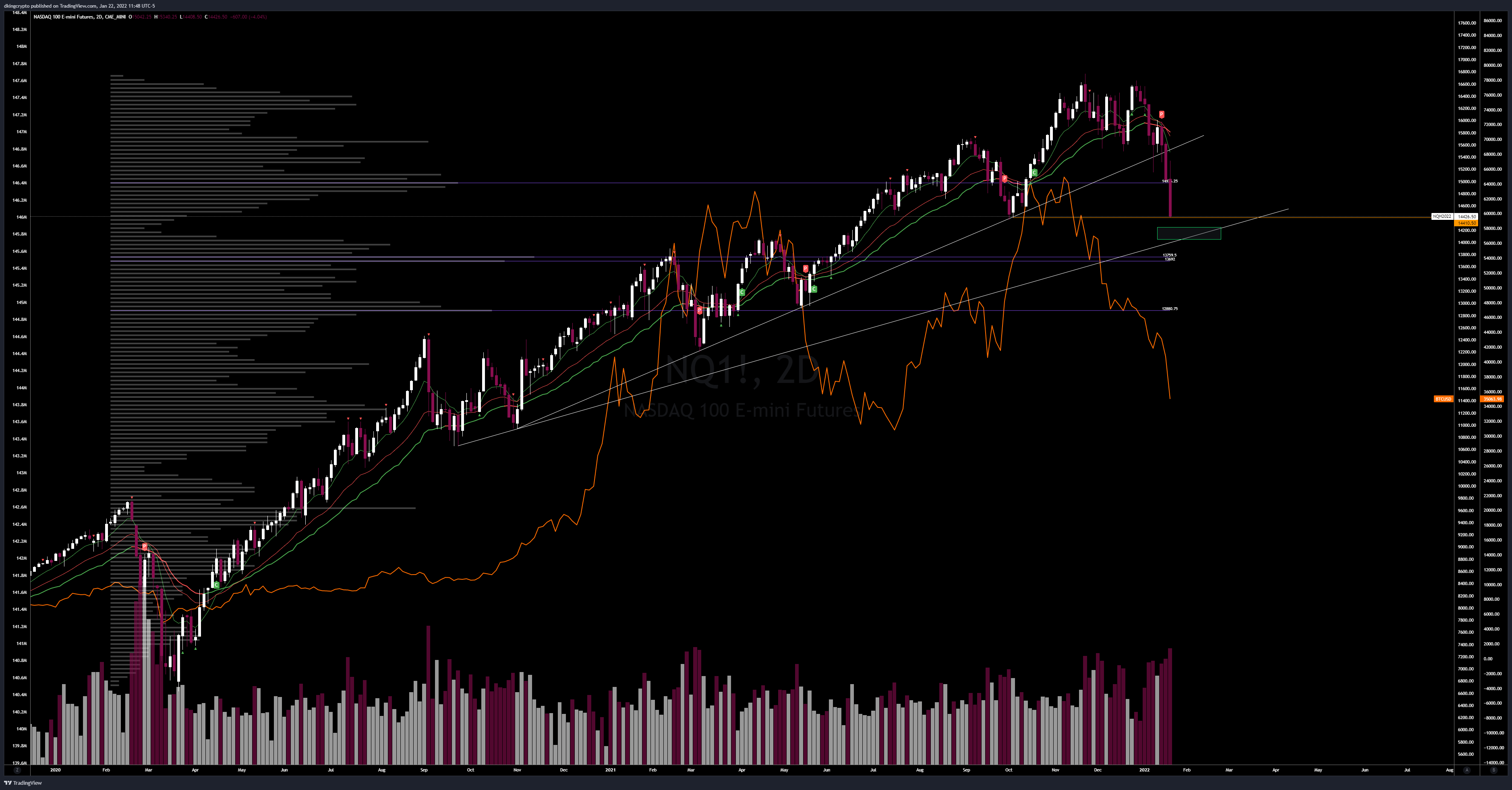
$NQ
Tech is currently sitting at support, this week will be extremely telling for future direction with tech ERs.
The next likely target is 14000, below that can lead to another 300 pt zipper.
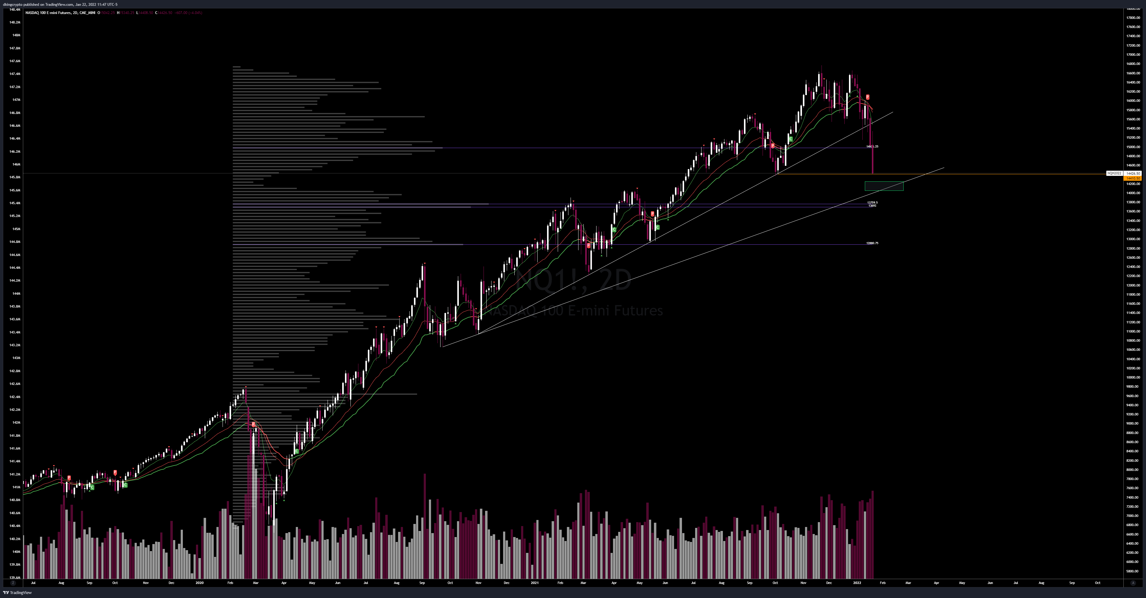
$NQ will be important to watch if you’re trading crypto. ($BTCUSD overlay in orange)
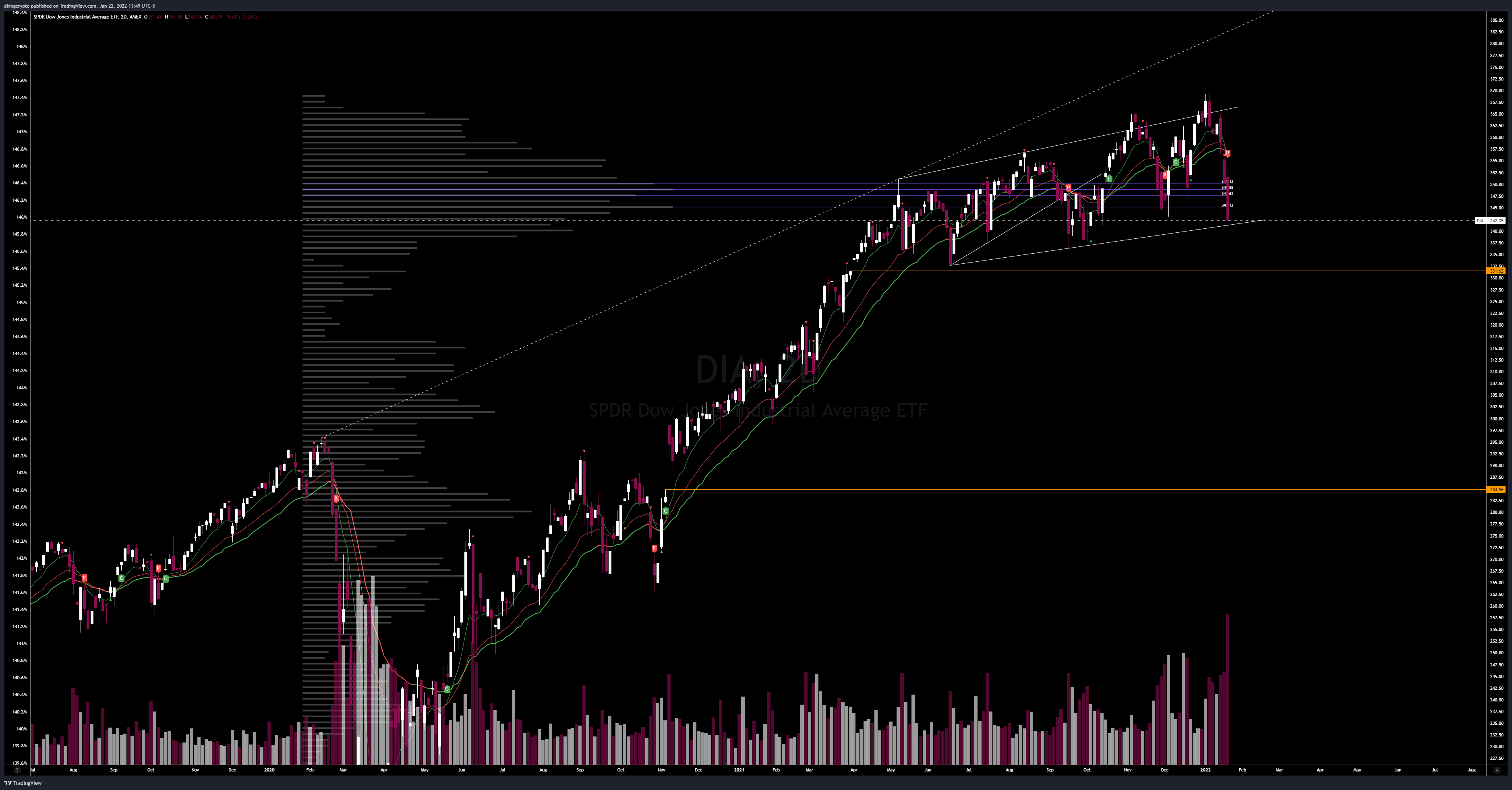
$DIA
Dow Jones is also close to breaking all macro supports out of this pattern.
Under 340 will likely test the gap at 331.
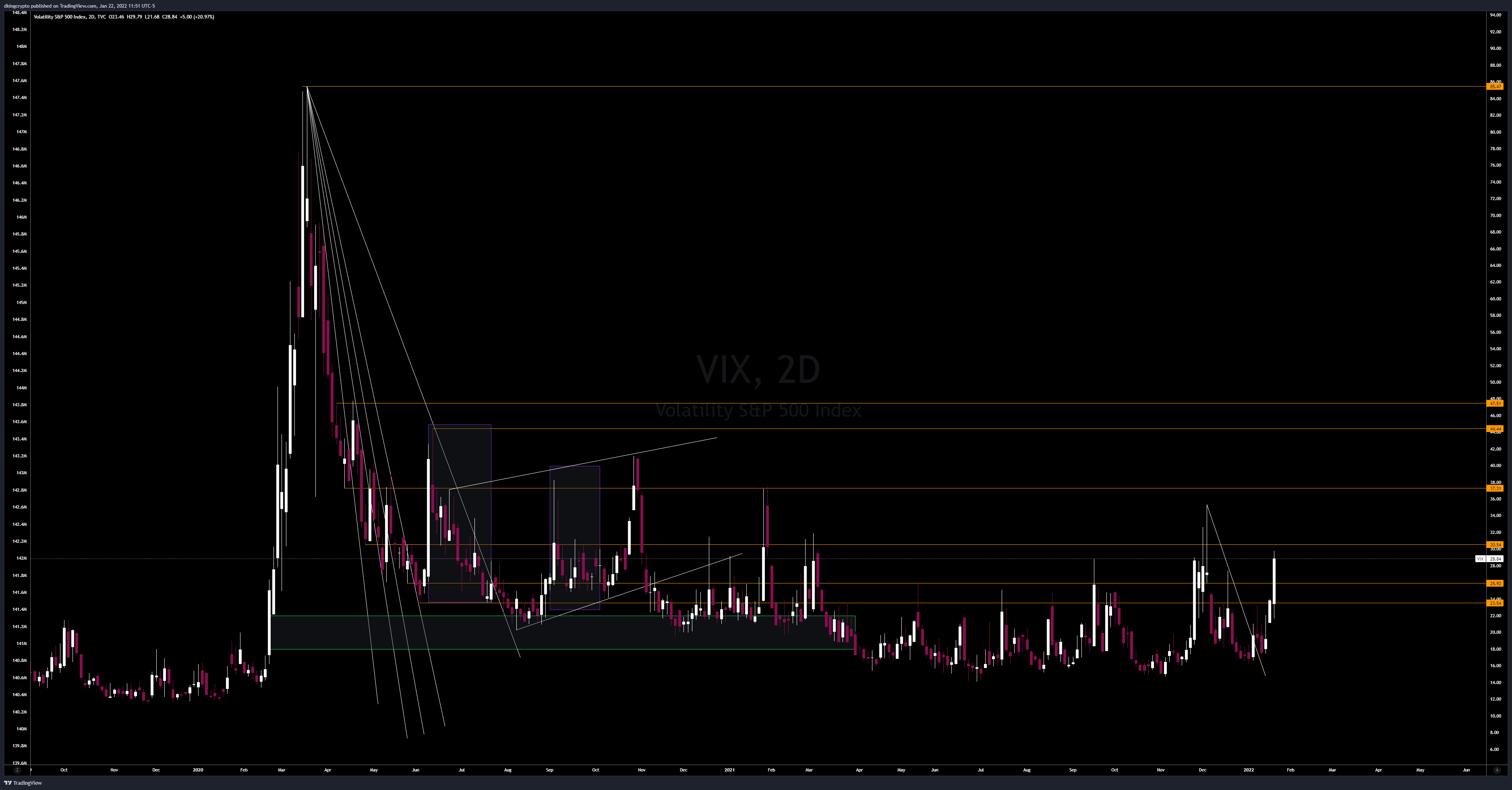
VIX
Keep an eye on VIX at all times. 30+ is always danger zone. So far, it looks extremely bullish.
$DXY
This will be important to watch as we see developments in inflation and yields. As I’ve told you before, $DXY has been inversely correlated to $SPX ever since the printer went brrr. This may change as policies shift and macroeconomic indicators change.

El Fin.
Take the time to read this, take notes, and digest (maybe read it more than once). I enjoyed spending hours on this analysis so I hope you enjoy it as well.
-DKing (January 22, 2022)
Look at us now! A genius!!
Love the analysis. Thanks for your Insights